Colour is arguably one of the most powerful tools in interior design. When applied correctly, it can instantly transform a room, evoke emotions, and enhance the personality of your space. Whether subtle or bold, colour plays a key role in creating a home that reflects who you are.
Our clients often ask for a neutral colour palette and express hesitation when I suggest that we add some colour to their decor. While colour can be intimidating, it does not have to be overwhelming. With the right approach, it can become one of the most exciting and transformative elements in your home.
So how do we take that leap and introduce colour in your space? Today I’m sharing the ways that we incorporate colour into a room, and how we do it so it feels effortless and intentional.
1. Build Your Scheme from the Ground Up
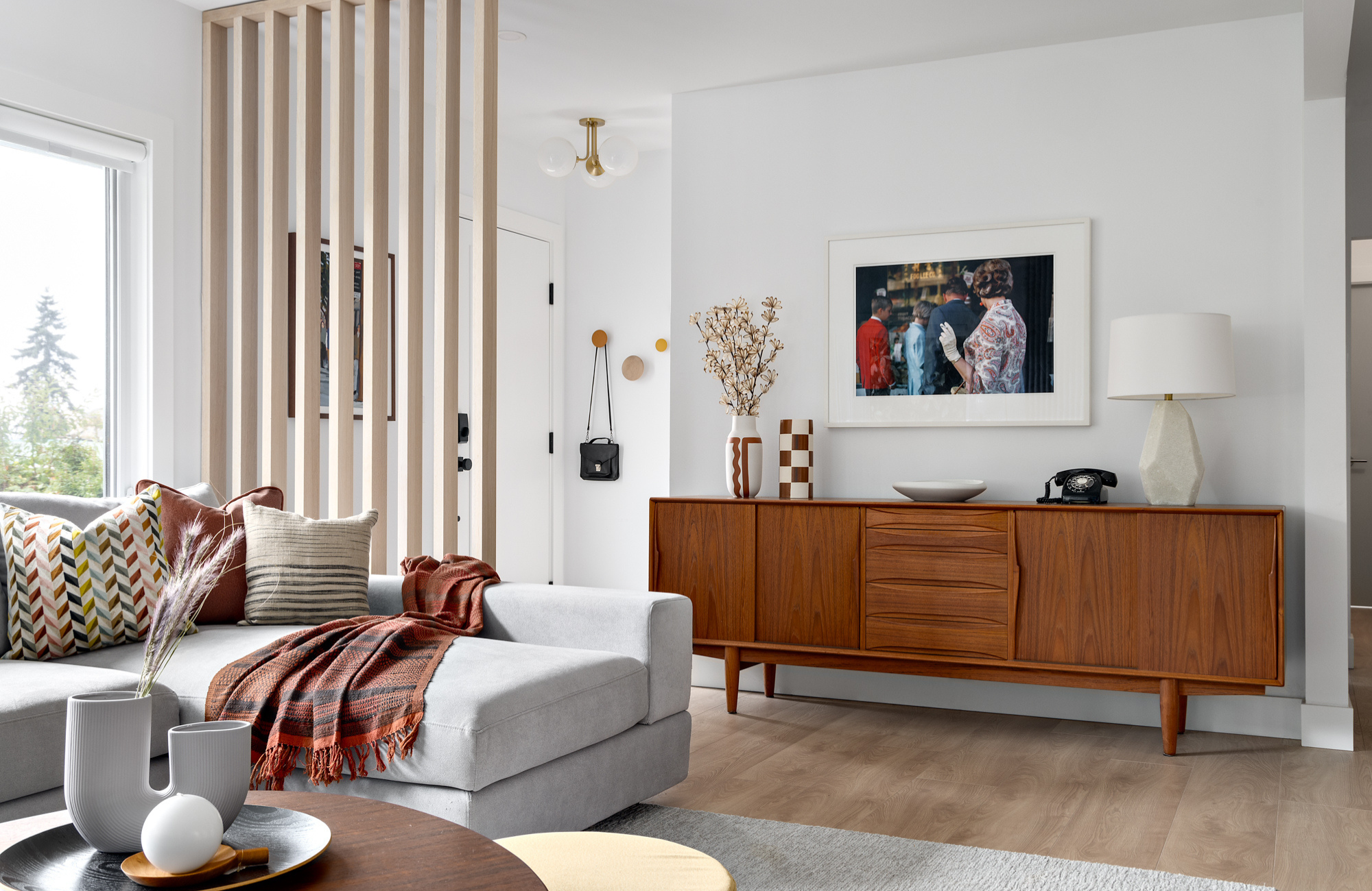
Clients often shy away from colour, particularly bold colours, because they are worried it will overpower their space or they might tire of it over time. The key here is to start with a foundation, like an area carpet, and then pull the colours upward. Since ground-level elements aren’t in your direct line of sight, they appear less dramatic, making your floor covering an ideal way to introduce colour without overwhelming the room.

In our Portside Court Project (pictured above), we grounded an otherwise neutral room with a colourful carpet. From there, we used subtle accents, like throw pillows and artwork, to pull out similar colour tones. This technique makes the space feel cohesive without being jarring, and it allows for flexibility should you wish to change your colour palette over time.
2. Use Artwork to Create a Colour Scheme
Artwork is one of my favourite starting points for establishing a colour scheme. A striking piece of art can define the palette for a room, with its colours guiding the selection of paints, fabrics, and finishes to create a cohesive and balanced space.

In the mezzanine of our PEI Project, we paired a green velvet sofa with a multi-colour striped ottoman and toss pillows to complement our client’s colourful pottery and art glass collection. The artwork brings in natural hues and perfectly balances the sofa, making the room feel cohesive and inviting.
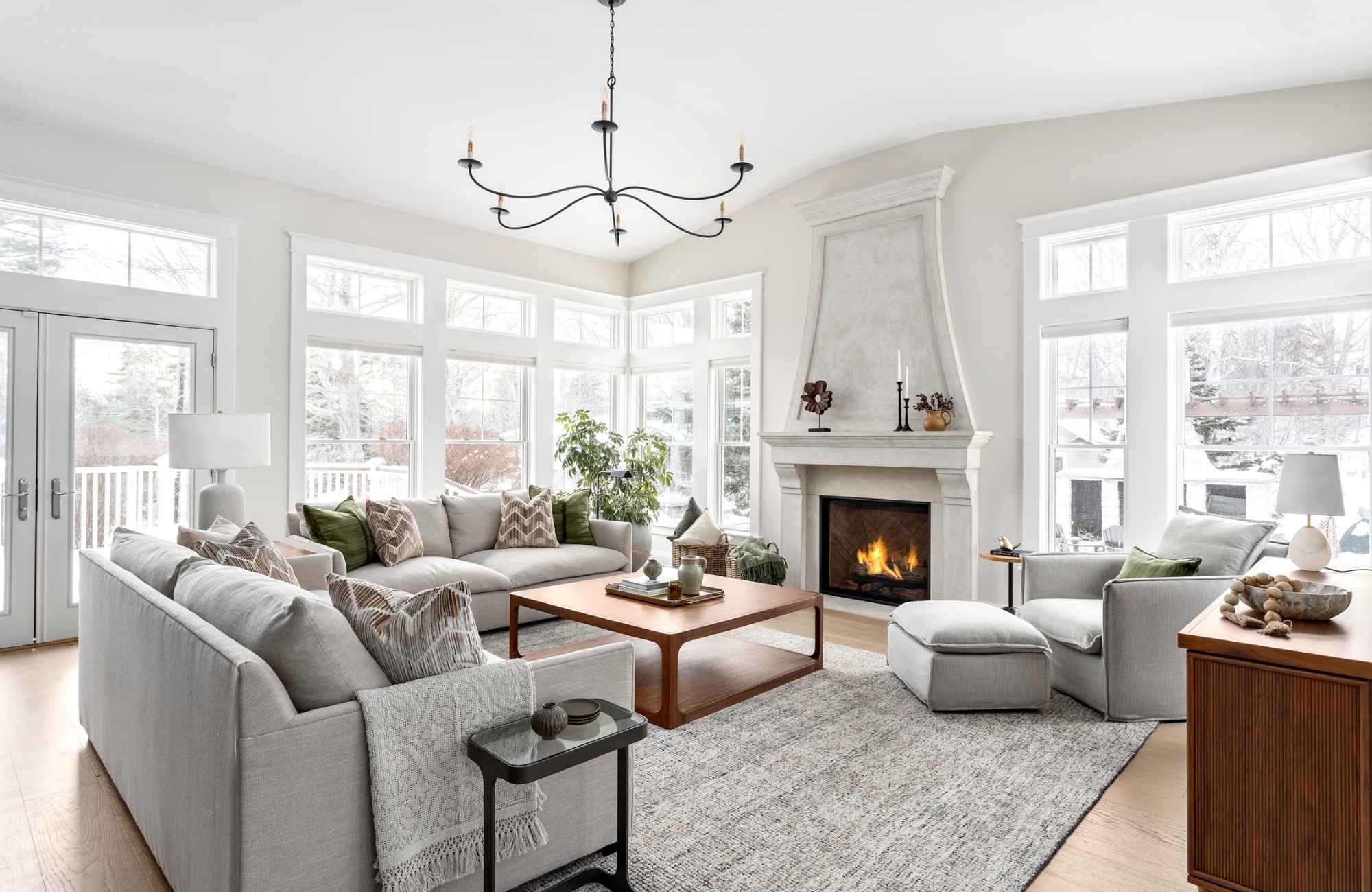
3. Keep It Simple
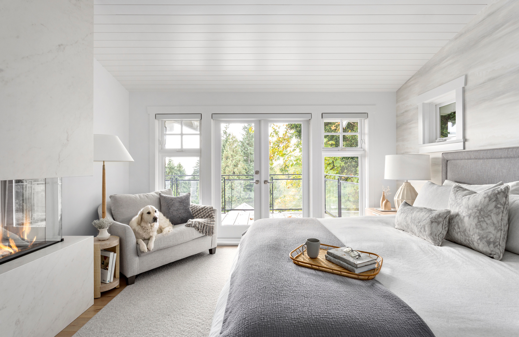
One of the best ways to make a space feel cohesive is by creating continuity with colour. A well-balanced palette fosters harmony, making your decor feel more intentional and inviting. The beauty of colour is that it doesn’t have to be bold to make an impact. Even something as subtle as choosing the right shade of white is a deliberate design choice that shapes the mood of a room.

A tone-on-tone palette is a powerful way to achieve visual continuity while keeping things simple and sophisticated. Our West Vancouver Coastal Home project is a perfect example—soft, neutral tones serve as a timeless foundation, while accents of blue in similar cool hues add depth and interest. By maintaining a consistent undertone across furniture, accessories, and artwork, we created a layered, organic feel that is both harmonious and visually dynamic.
This approach not only enhances interior flow and balance but also makes your space feel effortlessly curated. Whether you’re designing a modern, minimalist retreat or a cozy, inviting home, a tone-on-tone colour scheme ensures a refined, cohesive look that stands the test of time.
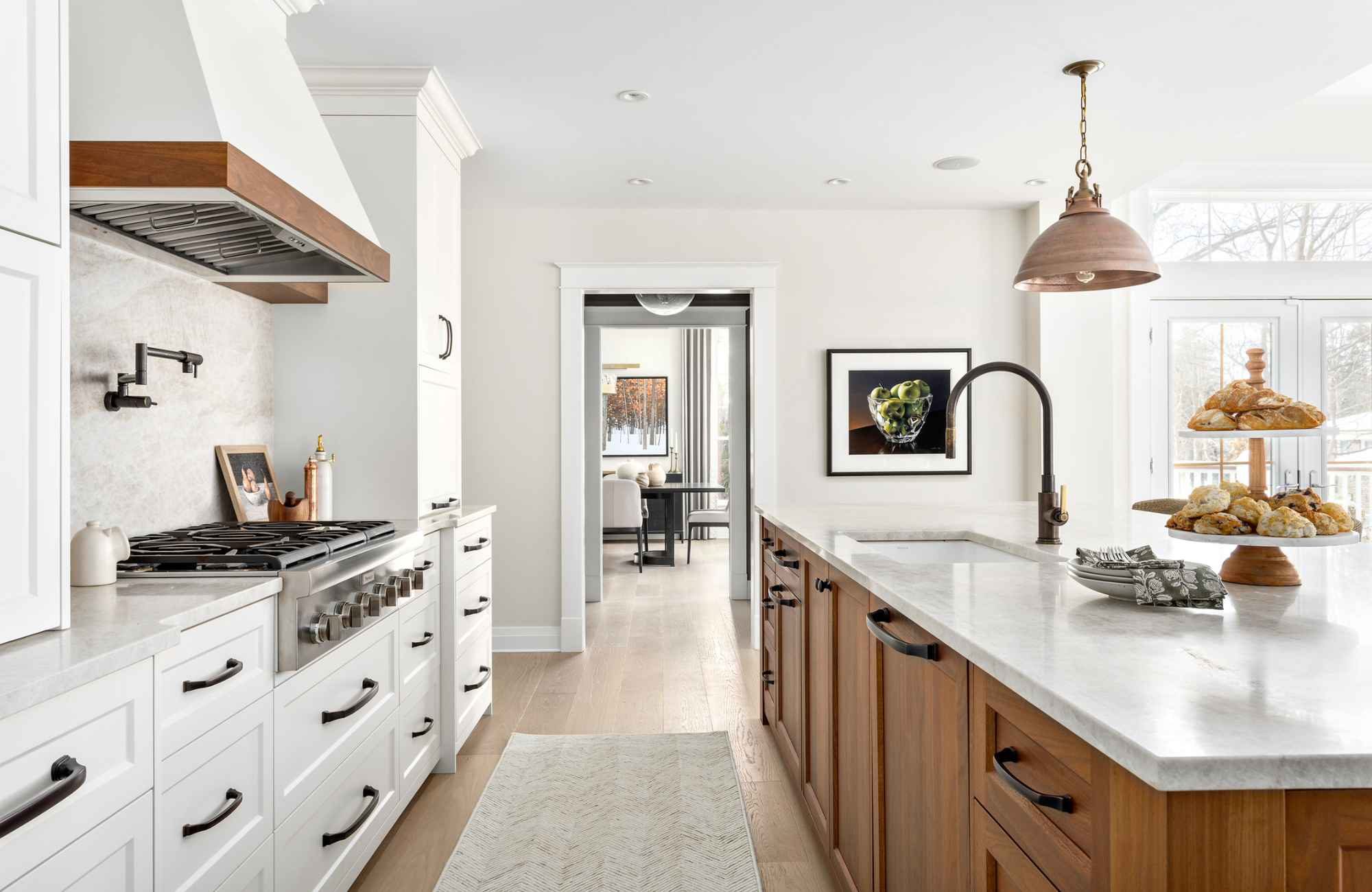
4. Create Drama with Contrast
While we often aim for harmony, sometimes a dramatic effect is exactly what a space needs. Rather than incorporating a lot of different colours, I tend toward a contrasting scheme—a combination of light and dark—to make a strong statement.

Larkhall Crescent Project (left); West Vancouver Coastal Project (right)
Darker cabinetry and accents, paired with a light backdrop, create an impactful yet balanced look. The contrast doesn’t overwhelm the space but adds a powerful presence and focus to the room— wouldn’t you agree?
5. Showcase Playful Personality with Bold Colours
While I naturally lean toward subtle colour palettes to create a peaceful atmosphere, not every space needs to be understated. If you’re craving a more playful and whimsical feel, there are plenty of tasteful ways to introduce bold colours.

For example, in our Lions Bay Project (left), the vibrant teal cabinetry adds a burst of fun while still feeling grounded in a cohesive, nature-inspired design. Similarly, in our West Vancouver Project (right), we added splashes of burnt orange and pops of yellow to infuse energy into the space. These colours bring a sense of personality and liveliness without overpowering the room.
6. Know When to Call in the Experts
Incorporating colour into a home is all about balance, and this is often where people feel stuck. You might love the idea of adding colour but struggle with how to do it in a way that feels natural and intuitive. This is where working with a designer makes all the difference. We understand how to weave threads of colour seamlessly throughout a room or an entire home, creating a sense of flow that feels intentional—not chaotic. The result is a space that’s cohesive, calming, and effortlessly inviting.

Whether you’re adding a touch of boldness or opting for a more subdued palette, it’s about creating a space that feels right for you. With the proper approach, colour can create an inspiring, balanced environment where you can relax, entertain, and truly enjoy the space.
If you’re ready to explore how colour can transform your home, I would love to help. Together, we’ll create a space that reflects your personality, lifestyle, and vision—one that feels fresh, exciting, and completely yours.
Yours,
Lori